Learning iPad Programming has received two negative reviews on Amazon, both concerning the print quality of the book. I’ve received a number of inquires because of these two reviews, so I decided to make a blog posting.
In short, there is nothing wrong with the print quality of the book. The paper stock is a little thin, but beyond that, the print version is of the same high quality as other programming books from Addison Wesley. This of course is my opinion, and my opinion is based on reading the book myself and comparing it to the many other programming book I own.
That said, I would like to address the concerns mentioned in the two reviews, which are available here and here.
Responding to the Reviews
The first review says, “This print version uses very small fonts, the figures are poor black/grey/white renderings of color images, and the paper is thin enough that the other side of the page is faintly visible.” Let me address each point.
“Very small fonts.” I disagree with this. The font size is the same size found in many other programming books including those from Addison Wesley.
“The figures are poor black/grey/white renderings of color images.” It is true that figure images are greyscale version of color images. The images are screenshots taken from my MacBook Pro and iPad, which means the images were originally color. But the greyscale rendering of the images is on par with other print books that I have compared. I guess it could be a matter of personal preference, but I have no issue with the quality of the greyscale images. That said, I wish the figure images were printed in full color, but that would only raise the cost of the book without providing additional value.
“The paper is thin enough that the other side of the page is faintly visible.” This is true, and it’s my one and only complaint about the print book. The paper stock is a little thin. The issue has been brought to the publisher’s attention, and they plan to use a thicker paper stock in the future. When that will happen is something I don’t know, but I have been told future printings will use thicker paper stock. (As of this writing, there have been two printings of the book, both using the thinner paper stock.)
As for being able to see print from the other side, yes, this is true, but it is faint and I only notice it in white space areas. It does not district me from reading the book, but YMMV. I’ll also point out that a number of other print books do the same. For example, while comparing my book to Cocoa Design Patterns, I noticed print from the other side is slightly visible and it uses a slightly thicker paper stock. In my opinion, this is something that happens when black ink is printed on most white paper stock. I even notice this on printouts from my home printer using standard quality inkjet paper stock.
The second review has this to say, “I became more and more frustrated with trying to read the small type printed in ink so light that it looked as if the printing press had run out of ink. The code listing font is even more difficult to read.”
Again, the font size is the same size found in many other books from Addison Wesley, and the code listings use the some font size. The only difference is the font style. A monospace font is used for the source code listing.
The light ink that “looked as if the printing press has run out of ink”, well, all I can say is it is possible that the reviewer did receive a defective book. However, I have reviewed 35 print versions from the first printing, and I did not find a single book with the issue of light ink. Again, it’s possible the individual received a defective book, but defective books are not common.
So is there a problem with the print version of Learning iPad Programming? Absolutely not. The paper stock is thin, and I wish that was not the case, but it does not, in my opinion, take away from the readability of the book. As for the font size, quality of figure images, etc, well, that’s probably a matter of preference.
How to Decide
How can you decide if the print quality is suitable for you? Here are some options for you:
1) Visit a brick and mortar book store and flip through the pages yourself. I know this is not an option for everyone especially those living outside the U.S., but for those living nearing a Barnes and Noble, stop by the store and compare the print quality to that of other programming books. I’m sure you will see little to no difference.
2) Take a look at this sample PDF. While not exactly the same as having a printed copy of the book in your hands, you can see what fonts are used, font sizes, the quality of the figure images, and so on. It is the best representation of the print book without holding the actual book in your hands.
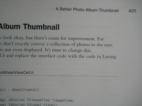
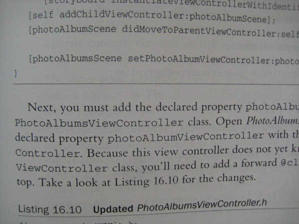
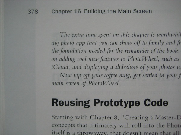
3) Take a look at the photos posted below. These are photographs of random pages from the book. I’m no photographer, so the pictures could be a little better - a lot better in fact - but as you can see the font size and print quality are very readable.
4) Buy the ebook edition. The book is available in the Kindle Book Store, iBooks Store, and from informIT.com as PDF and epub. This option also saves trees, and it has become my prefer way to purchase new books.
Compare the sample PDF and photos below then decide for yourself if the print version is suitable for you. And if by chance you happen to receive a deflective book then let me know. Send me specific page numbers, and I can request a warehouse inspection. Or send me the book, and I’ll make sure you receive a good copy.
All Feedback is Good Feedback
One last point to make. In no way am I saying the two individuals should not have posted the reviews. On the contrary, all feedback, good and bad, is welcome. All feedback is good feedback in my opinion. And if these individuals had not posted the reviews then the publisher would not have agreed to use a thicker paper stock in the future. So post your review, good or bad, to Amazon. It will help make this book and others that much better.


